Light/Dark Theming Walkthrough
CISentinel's web GUI supports both light and dark themes with a one-click toggle.
Toggling Theme
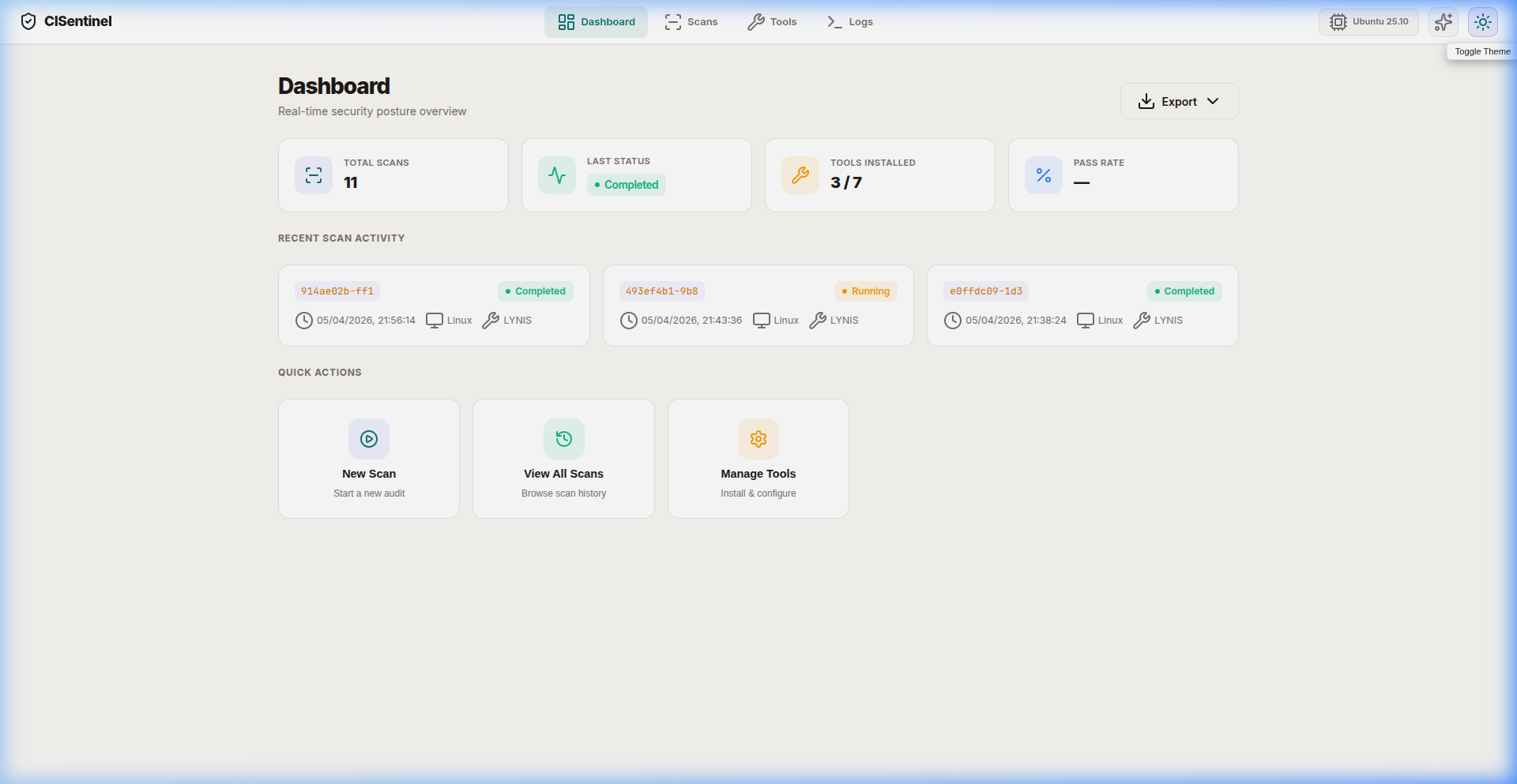
Click the 🌙 moon (or ☀️ sun) button in the top-right of the navigation bar.
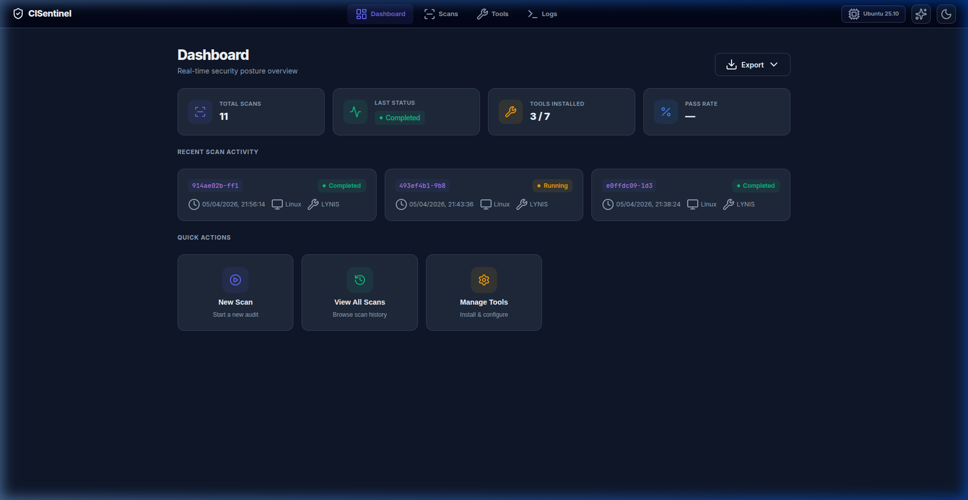
Dark Theme (Default)
The dark theme features: - Deep background (#0f0f23) - Subtle card surfaces with glassmorphism effects - Primary color: Indigo (#6366f1) - Accent color: Violet (#8b5cf6) - Color-coded status badges that pop against dark backgrounds - Comfortable contrast ratios for extended use
Light Theme
The light theme adapts: - Clean white background - Subtle shadows instead of glassmorphism - Same color accents (indigo/violet) on light surfaces - Adjusted text contrast for readability
Theme Persistence
The selected theme is stored in localStorage and persists across browser sessions.
CSS Variables
Both themes use CSS custom properties for easy switching:
:root {
  --bg-primary: #0f0f23;
  --surface: rgba(30, 30, 50, 0.8);
  --primary: #6366f1;
  --accent: #8b5cf6;
  --success: #10b981;
  --warning: #f59e0b;
  --danger: #ef4444;
  --info: #3b82f6;
  --text-primary: #f1f5f9;
  --text-muted: #94a3b8;
}

[data-theme="light"] {
  --bg-primary: #f8fafc;
  --surface: rgba(255, 255, 255, 0.9);
  --text-primary: #1e293b;
  --text-muted: #64748b;
}